
I’m just finishing up a character study of Ghetsis, the villain of Pokémon: Black and White, at the behest of my shadowy masters on the Dark Council. I have some thoughts on his character design, which I didn’t want to put into the main piece because the visual design of the human characters isn’t really something I’m normally interested in and it wasn’t especially relevant to the thesis of the article, but I also don’t want to not post it at all because I think I might have noticed something new here. So… here’s… that!

Trying to work out every influence that might conceivably have gone into Ghetsis’ wardrobe can lead you down some dark and twisted rabbit warrens of mystic esoterica, and although I’m deeply sceptical of a lot of “hidden symbolism in Pokémon designs” bull$#!t, it’s hard to deny that Ghetsis, in his original Black and White outfit, looks like he shops at a thrift store run by the Illuminati. As far as I know, all the developers have ever said is that they wanted him to look “unusual” and his clothes to be “extraordinary,” but everything about him is ridiculous and someone on the design team was clearly trying to recklessly Do A Symbolism. Team Plasma in general has a Mediaeval European aesthetic: they have a “King,” N, whose headquarters is a castle; the grunts wear long tunics emblazoned with an emblem in the shape of a heraldic shield, and silver-coloured boots, gloves and cowls that look like mail armour. I can, at a stretch, even believe the suggestion that they’re supposed to be Knights Templar, because the Templar Order has a pop cultural association with extreme zealotry, something Team Plasma is known for as well. The big heavy collar of Ghetsis’ robes, which could be interpreted as looking like either a crown or the crenellations of a castle wall, is probably an extension of that aesthetic; so is the sword-like cane he holds in Black and White 2, and arguably his entire… well, vibe, frankly.
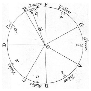
The flipped colours of the left and right sides of his robe create a sort of yin-yang light-and-dark effect, fitting in with the game’s big thematic motif of opposites, conflict and harmony. I suspect there might be something more to it, though, which is where I’m going to start saying some things that sounds a little bit off-the-wall. The rest of the Seven Sages all have names that reference colours – Rood (red), Bronius (brown), Giallo (yellow, from Italian), Ryoku (green, from Japanese), Gorm (blue, from Gaelic) and Zinzolin (purple, from French) – which makes some thematic sense; the games are called Black and White, so colours are supposed to be on our minds. They all have different coloured robes, although their robes are mixed up and don’t match their names except for Zinzolin and Ryoku (which I suspect might be a mistake or oversight). If we allow Bronius for orange, we have all the traditional “seven colours of the rainbow” except for indigo (which is usually understood to be a sort of midnight blue colour); I’m inclined to think that Ghetsis is therefore the indigo sage, and indeed his robe is indigo and yellow. Ghetsis doesn’t have a colour name, though; he has a musical name: derived from G-Cis, referring to the musical notes G and C-sharp, which are used prominently in his battle theme and together form a tritone, a type of musical interval that used to be considered “dissonant” in western classical music and therefore had the nickname diabolus in musica, “the devil in the music.” Sinister indeed. That’s all nothing new to the fan community, but what I think may have gone unnoticed before is that there’s actually a link between colour and music that might be pertinent here. Most people don’t actually see seven distinct colours in a rainbow; orange is pretty hard to pick out, and hardly anyone sees a distinct indigo band. The reason we have “seven colours of the rainbow” is because, way back in the 1660s, Sir Isaac Newton wanted to map the colours of the visible spectrum onto the seven notes of a musical scale in the Dorian mode, D, E, F, G, A, B, C and back to D – which he did using the diagram shown below, with the spectrum starting at red and cycling back to red. And… well… it’s not totally unambiguous how the diagram is meant to be read, and I’m not certain this is a deliberate reference, but damned if it doesn’t look to me like G/C# – Ghetsis’ name – might correspond to the interval between yellow and indigo – Ghetsis’ colours. His clothes “spell out” his name in bat$#!t Newtonian musical colour theory.
It is, of course, thoroughly unprovable that the designers intended to do something this esoteric and weird with Ghetsis’ design. However, it fits into enough of Black and White‘s other motifs – colours, harmony, N’s obsession with mathematics and physics, the missing indigo sage – that I think it’s still kind of cool even if I literally just made it up.
[Special thanks for checking my thinking here to music teacher Ian, from I Chews You, the podcast about cooking and eating Pokémon (look, it happens to fulfil a very specific confluence of my interests; this is my blog and I’ll plug whatever I want)]

According to a survey conducted by Randall Munroe (the xkcd guy), indigo doesn’t exist outside the context of a rainbow either. Interestingly, he cited the old “Roy G. Biv” mnemonic, so I now find myself shaken at the idea that there are references so nerdy even Randall Munroe doesn’t know about them…
Another interesting fact while I’m here: the color orange is actually named after the fruit, not the other way around, so in Newton’s time it may have fallen into the same “that’s not a color you idiot, wait here while I get a doctor to treat the concussion that apple obviously gave you” category.
LikeLike
I just read the Reddit post you linked to, and wow that is some serious bulls#!%
LikeLiked by 1 person